HUman Clarity System
UNICEF’s work was strong. But in Aotearoa, it wasn’t landing. The problem wasn’t visibility. It was distance.
Project Note
Organisation: UNICEF Aotearoa
Role: Creative Director + Brand Strategist
Contribution: Narrative + messaging · documentary-led storytelling · visual system · UX + content architecture
Evidence: 12%+ lift in awareness across key demos · 446% increase in donation revenue · brand book + style guide + organisation wide templates
UNICEF didn’t have a credibility problem. It had a translation problem.
The work was real. The impact was real. But too much of the brand asked people to translate programmes, structures and language into something they could actually understand and feel.
I saw an opportunity to remove that distance - to make the consequence of UNICEF’s work the starting point for how the brand communicated, rather than asking people to work their way towards it.
Don’t explain the impact. Put people closer to it.
Project Profile

UNICEF spoke in the language of programmes, structures and reporting. Accurate, but abstract and overcomplicated.
The impact was real. The way it was communicated made it feel remote.
I led an organisation-wide shift from fragmented communication to a single clarity system - aligning messaging, storytelling, campaigns and content around one principle:

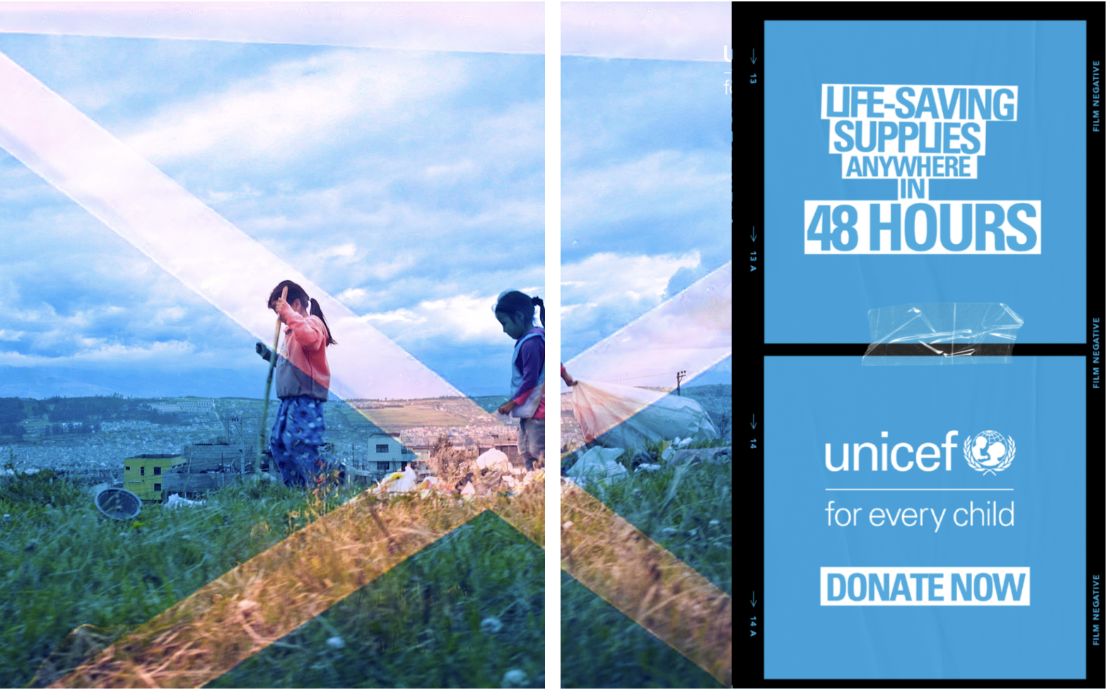
Impact should be felt. Not explained.

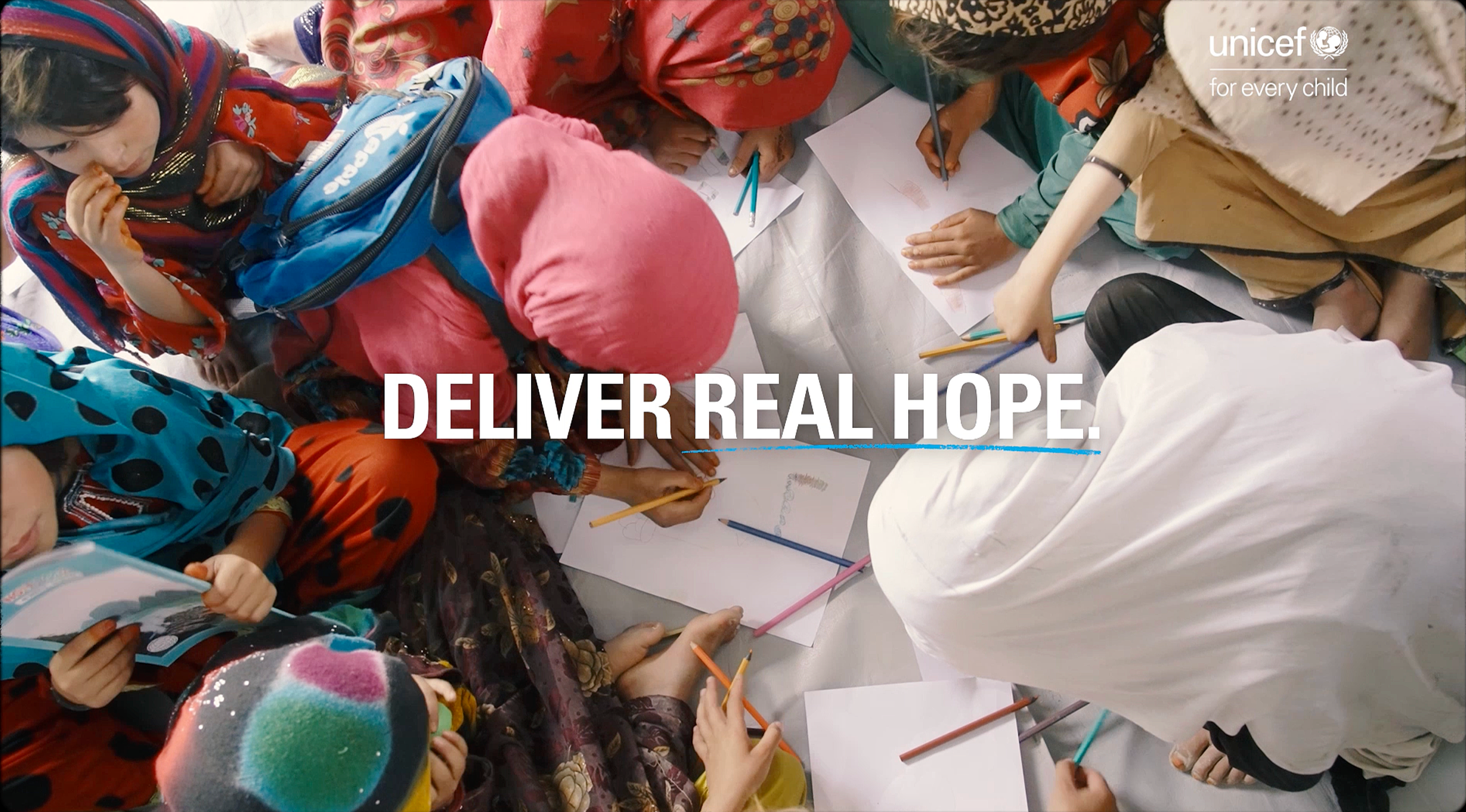
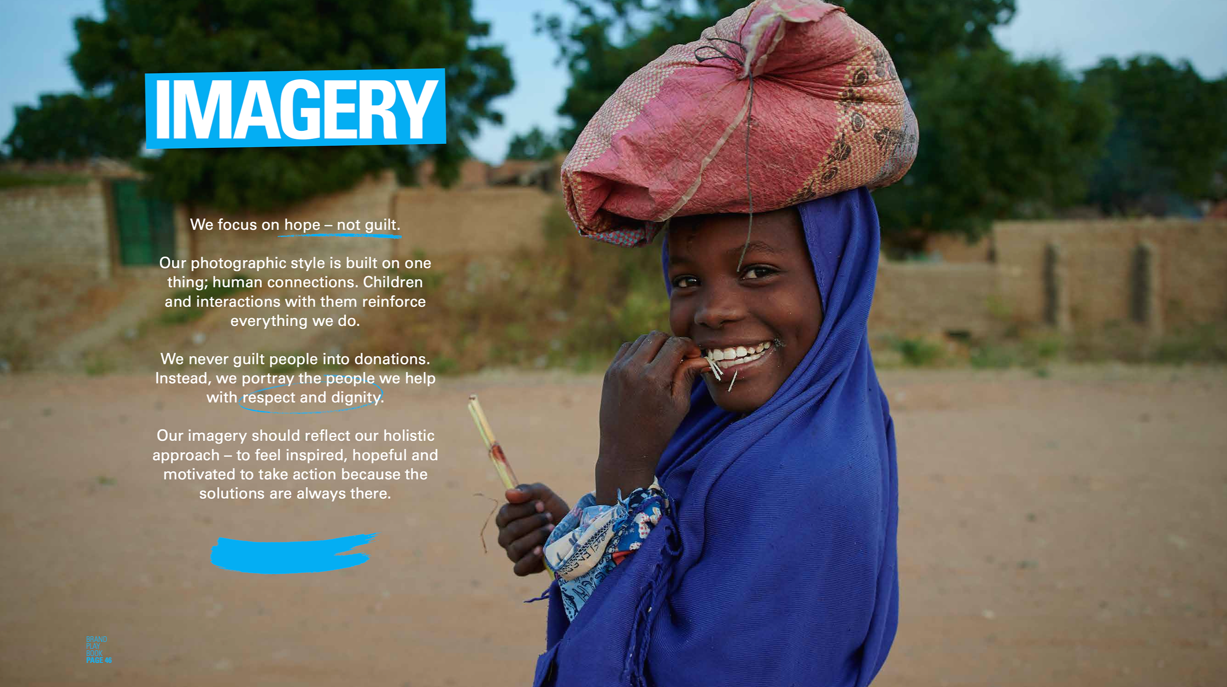
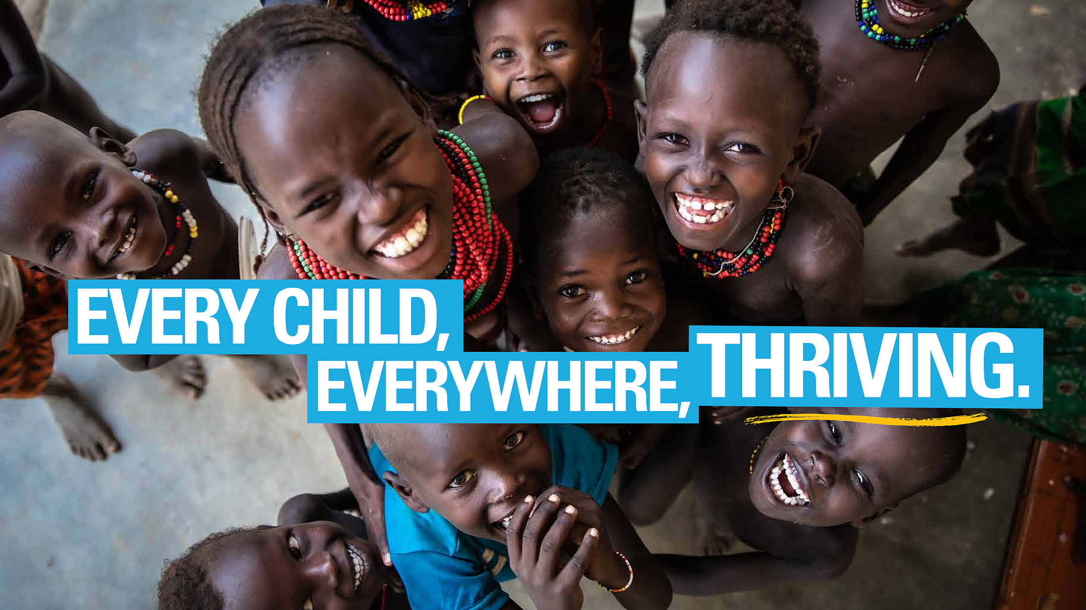
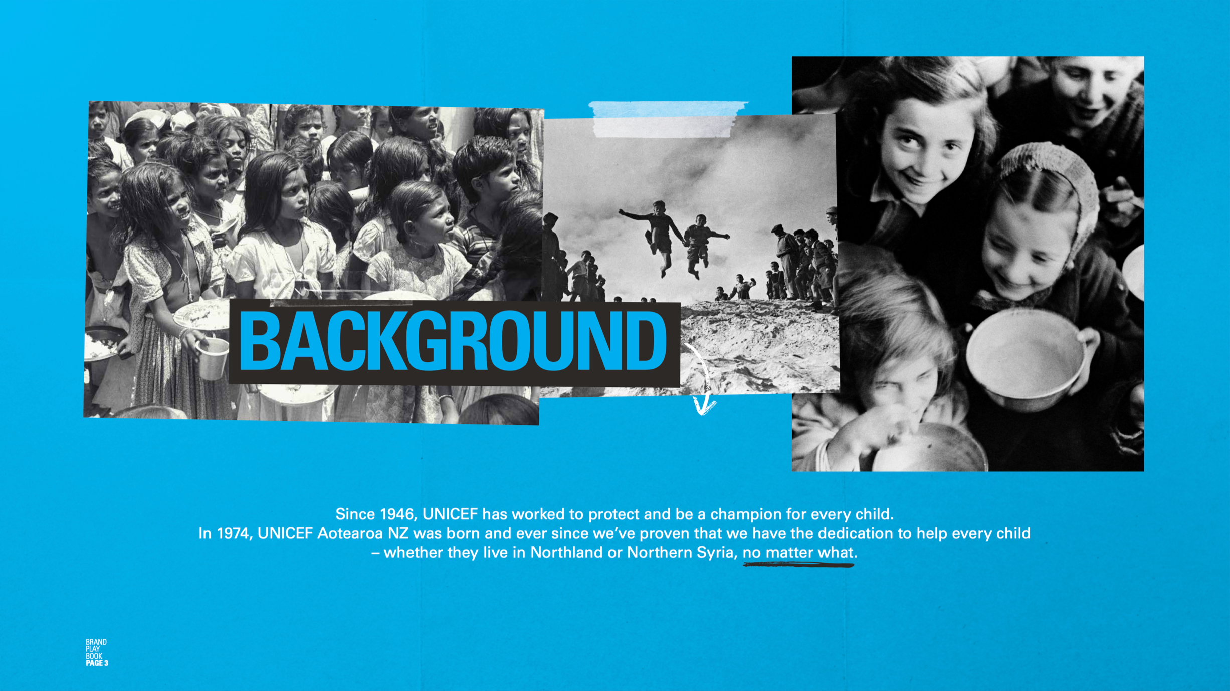
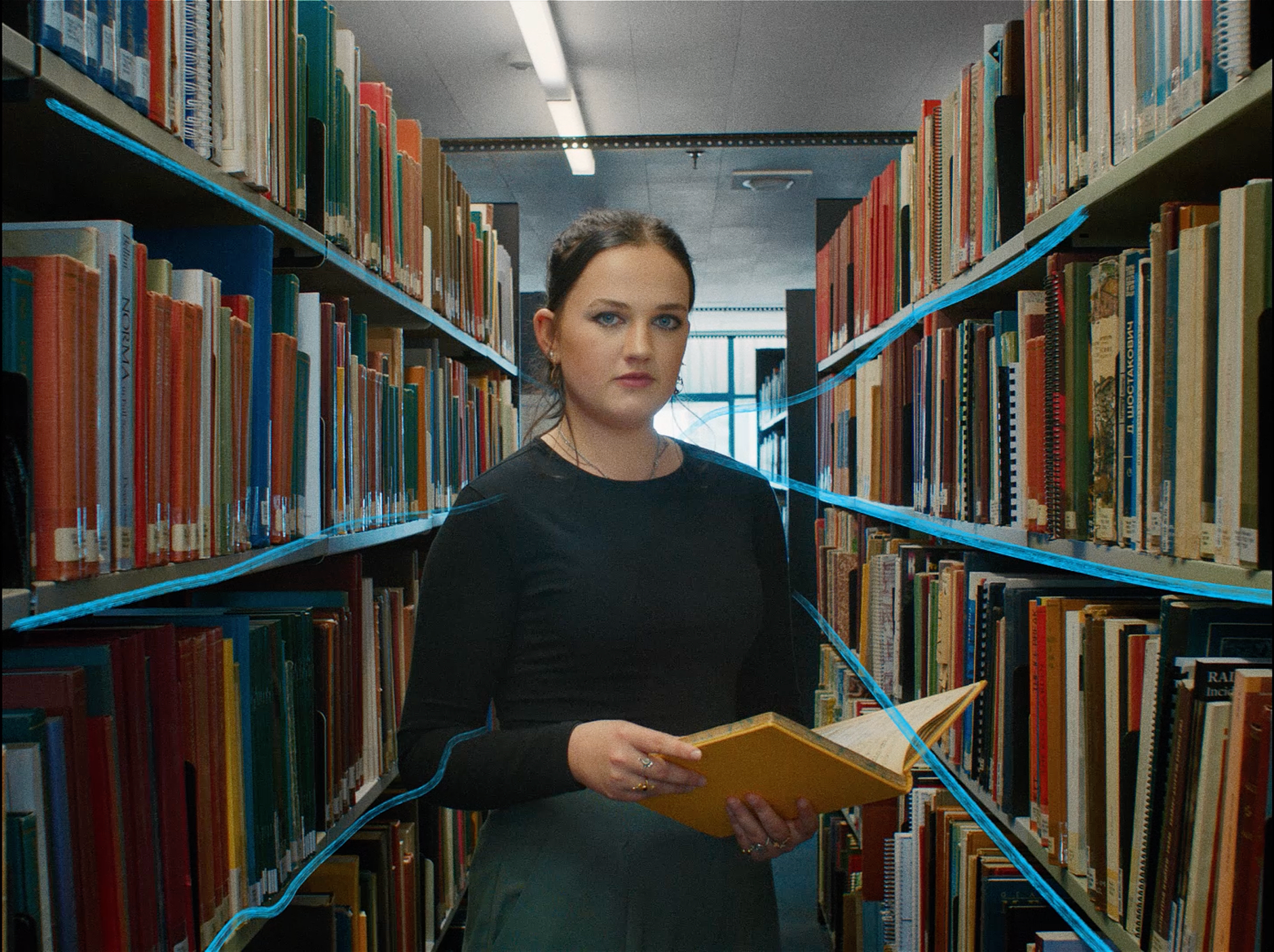
We moved UNICEF’s expression from institutional abstraction to lived reality - using documentary-led storytelling grounded in real children, real environments and real outcomes.
Imagery stopped illustrating impact. It became evidence of it.
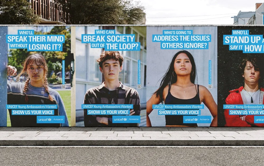
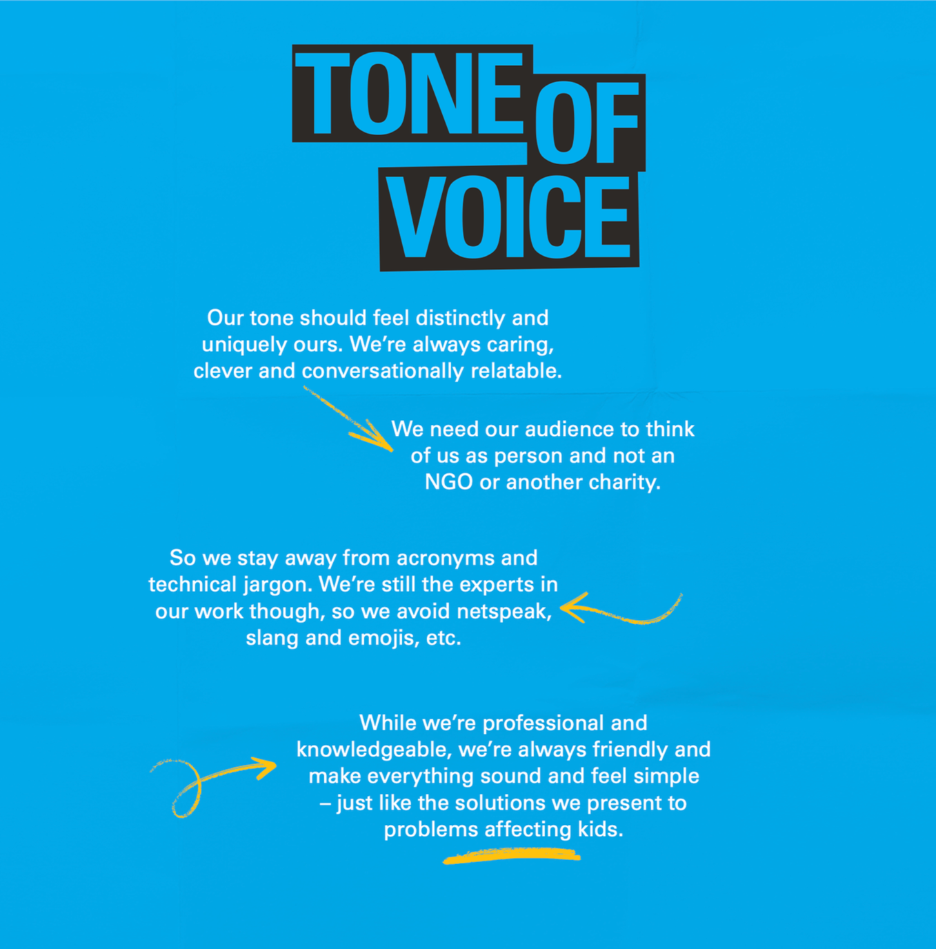
Language stopped trying to convince. It invited people in.

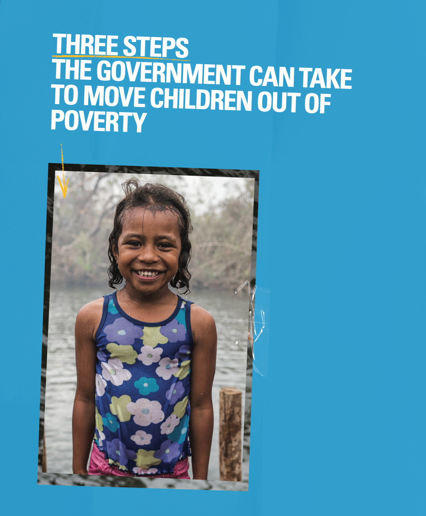

REAL CHANGE MADE VISIBLE.
Across channels, the brand system was designed so every touchpoint reinforced the same idea: This is not an organisation speaking about change - this is real impact made visible.
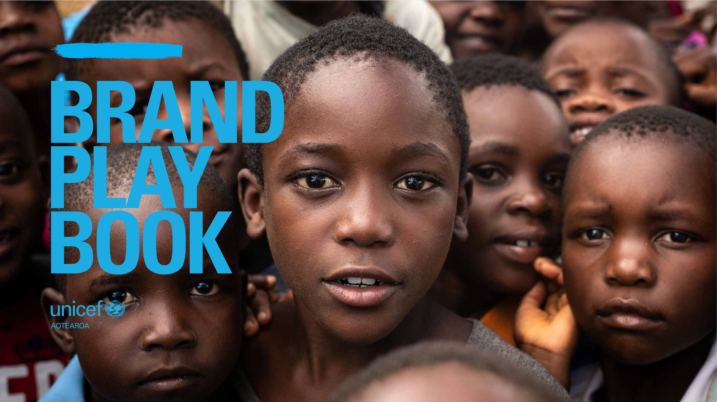
That thinking was then built into the tools people actually used - from brand books and style guides to campaign templates and everyday comms - giving the organisation a practical way to express itself with greater clarity and consistency.

Behind this I created a unified UX and content architecture system - including journeys, storytelling modules, and an ecommerce experience designed to make contribution tangible.
A more direct, emotionally sincere public presence emerged. The result was a brand communication system that didn’t just explain UNICEF’s work more clearly, but made it easier to believe in. To trust.

It all contributed to a 12%+ lift in awareness across key demographics and a measurable shift in donor behaviour, revenue & retention.
12%+ INCREASE IN awareness
446%+ increase donation revenue