THE HUMAN EXPERIMENT
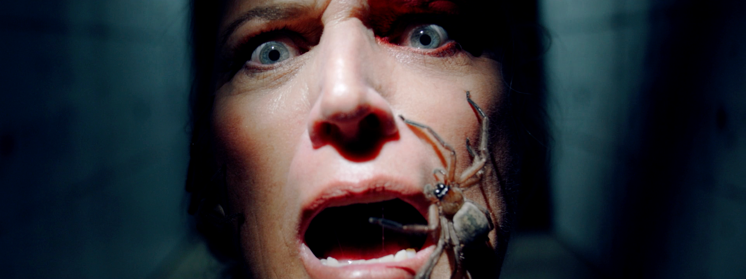
More than 8,000 Kiwis applied. Sixteen made it to Nicaragua. Ready to be pushed to their limits. Before the game began, I wanted to warn everyone what they’d signed up for.
Project Note
Organisation: TVNZ
Role: Director + Editor
Contribution: Creative interpretation · performance + character · visual world-building · stills direction · multi-use production system
Evidence: 230,000+ average viewers (5+) · 172,000 viewers aged 25–54 at launch · Top 5 among TVNZ OnDemand's most-streamed shows
The brief opened a territory. I found the strategic idea beneath’The Warning’: Survivor as human behaviour under extraordinary pressure.
“The Human Experiment” became more than a campaign line. It became the creative rule for how we made the work - treating contestants as subjects, revealing them through observation, character and evidence rather than simply introducing a cast.
That thinking shaped everything from the films and photography to props, environments, outdoor and the physical Survivor HQ — giving every expression its own form while belonging to the same world.
Project PROFILE
The concept became all about treating the contestants less like reality-TV stars and more like subjects in the ultimate physical and social experiment.
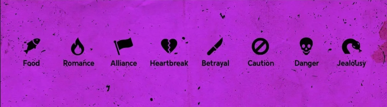
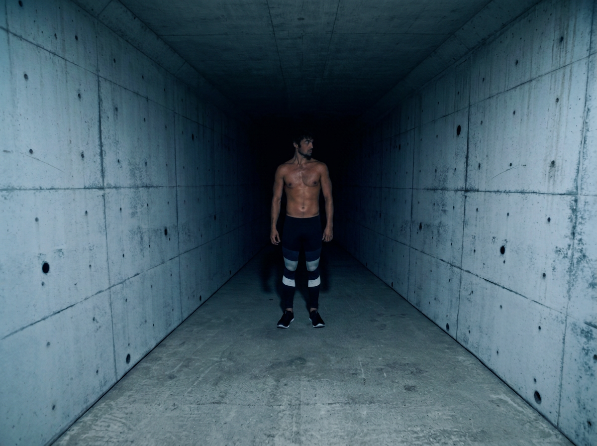
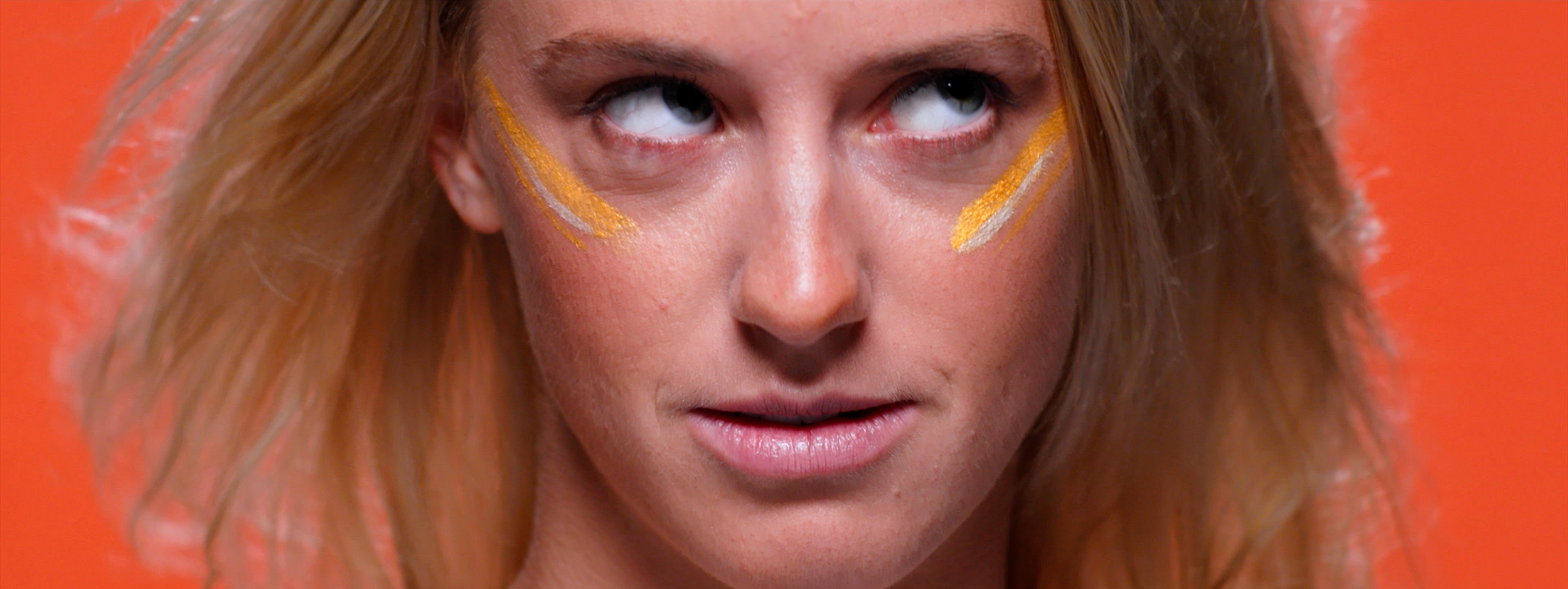
The result was an pop-art world - bold, colourful and slightly unsettling. Part warning, part scientific study, part invitation to watch the experiment unfold.
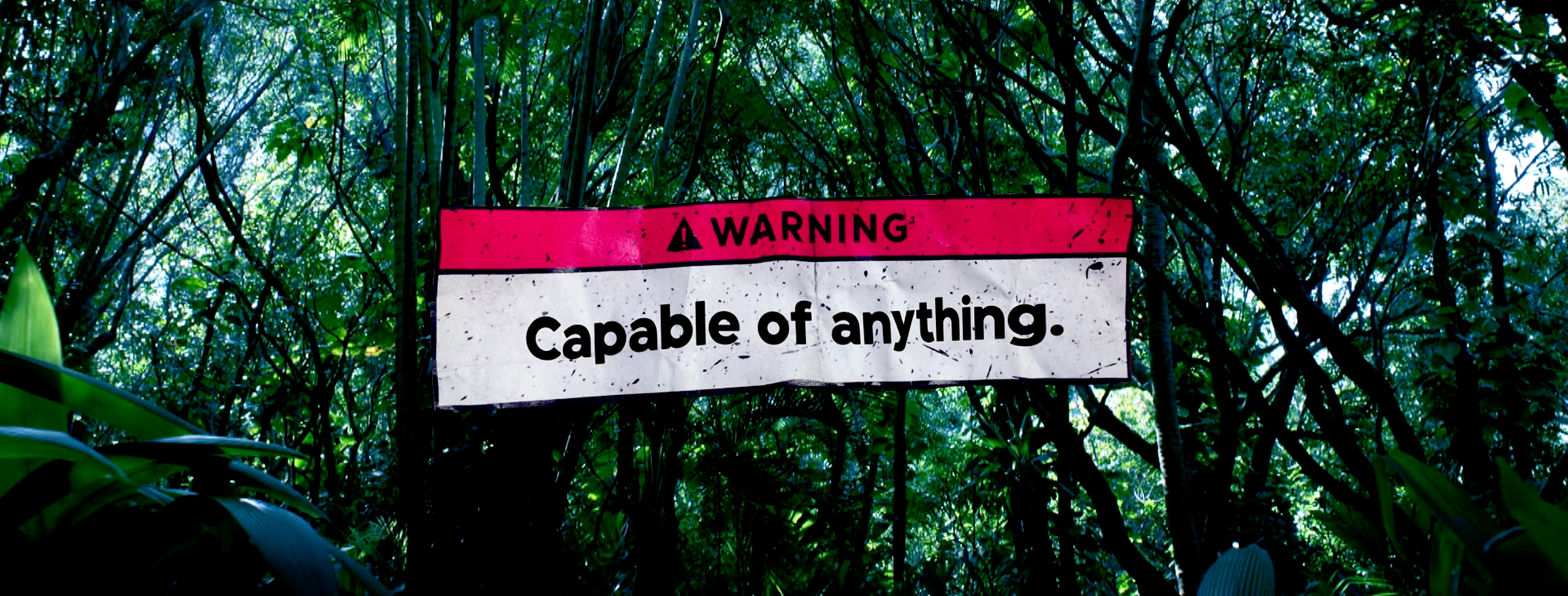
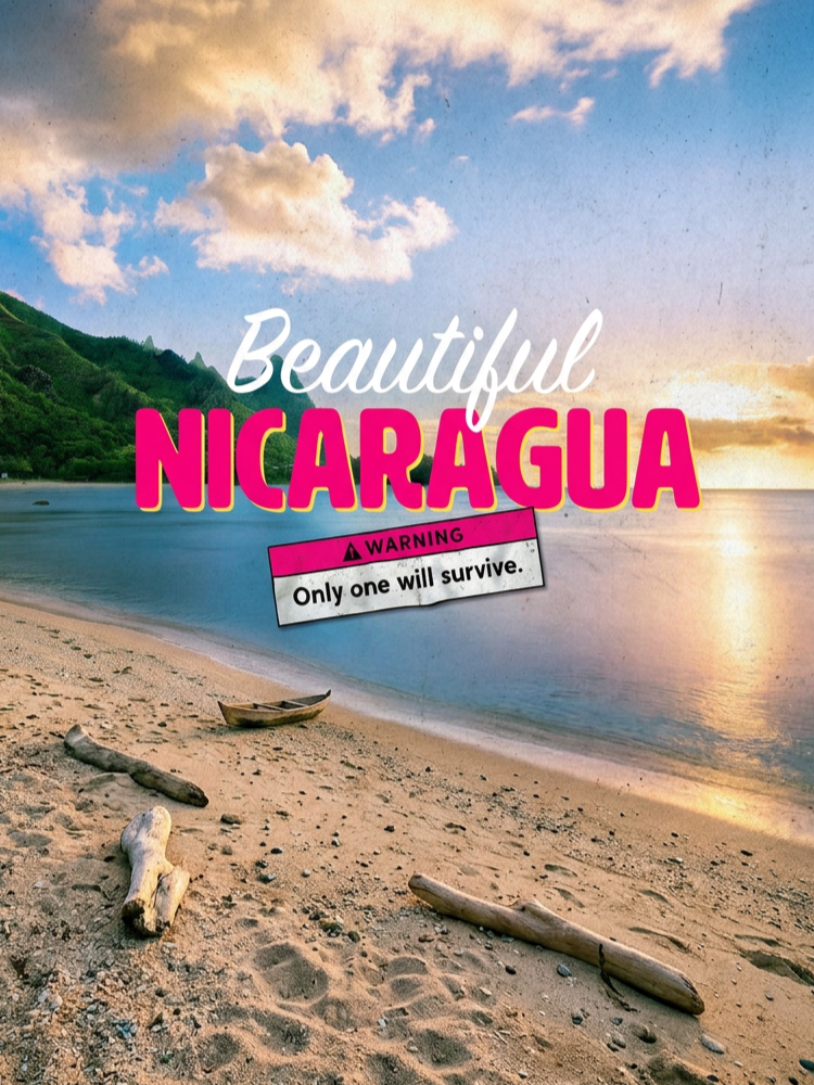
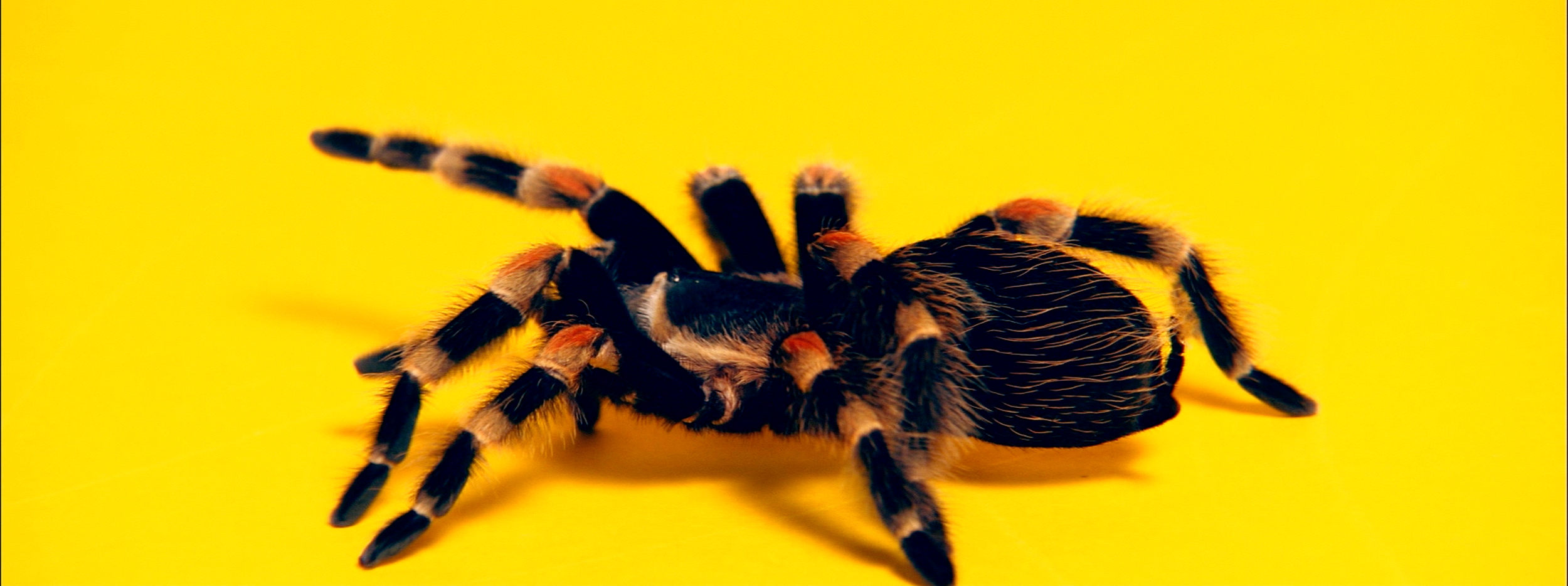
A series of fictional Nicaragua tourism ads and other intriguing content introduced the premise with cryptic warnings.
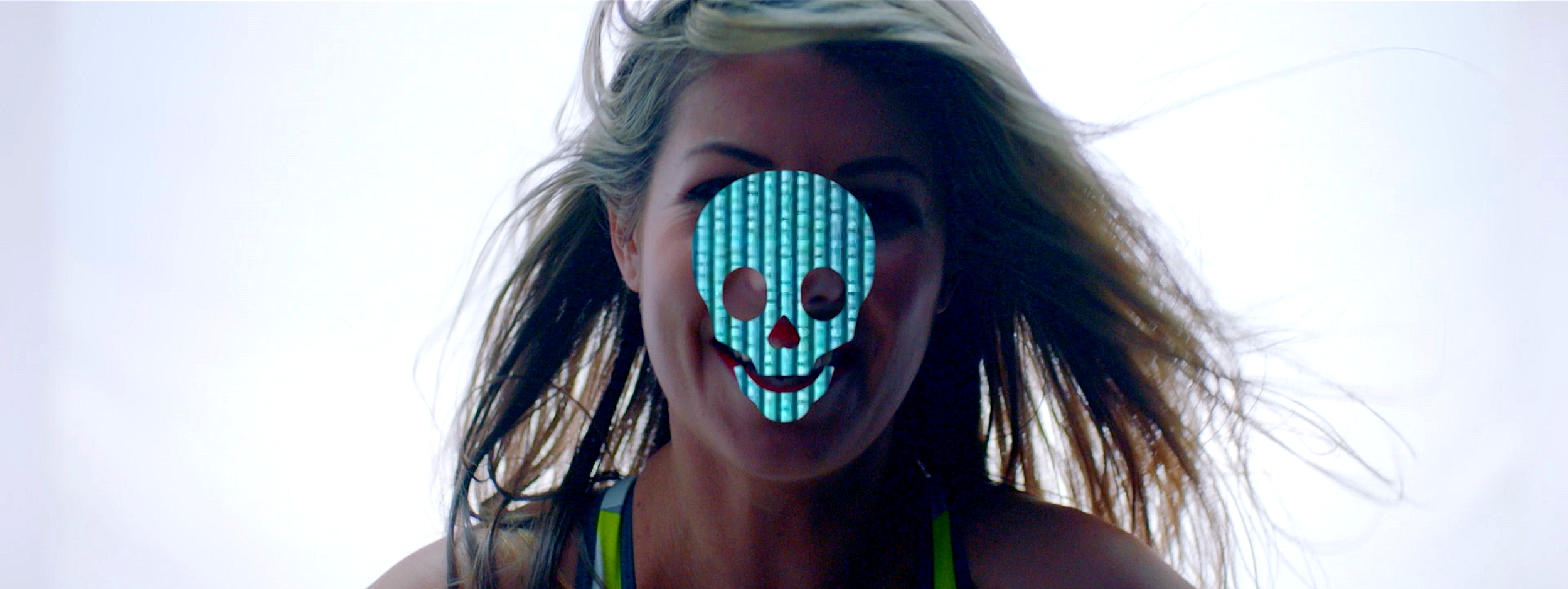
Teaser films obscured the contestants, turning faces into clues and building curiosity before the reveal of the eclectic cast.

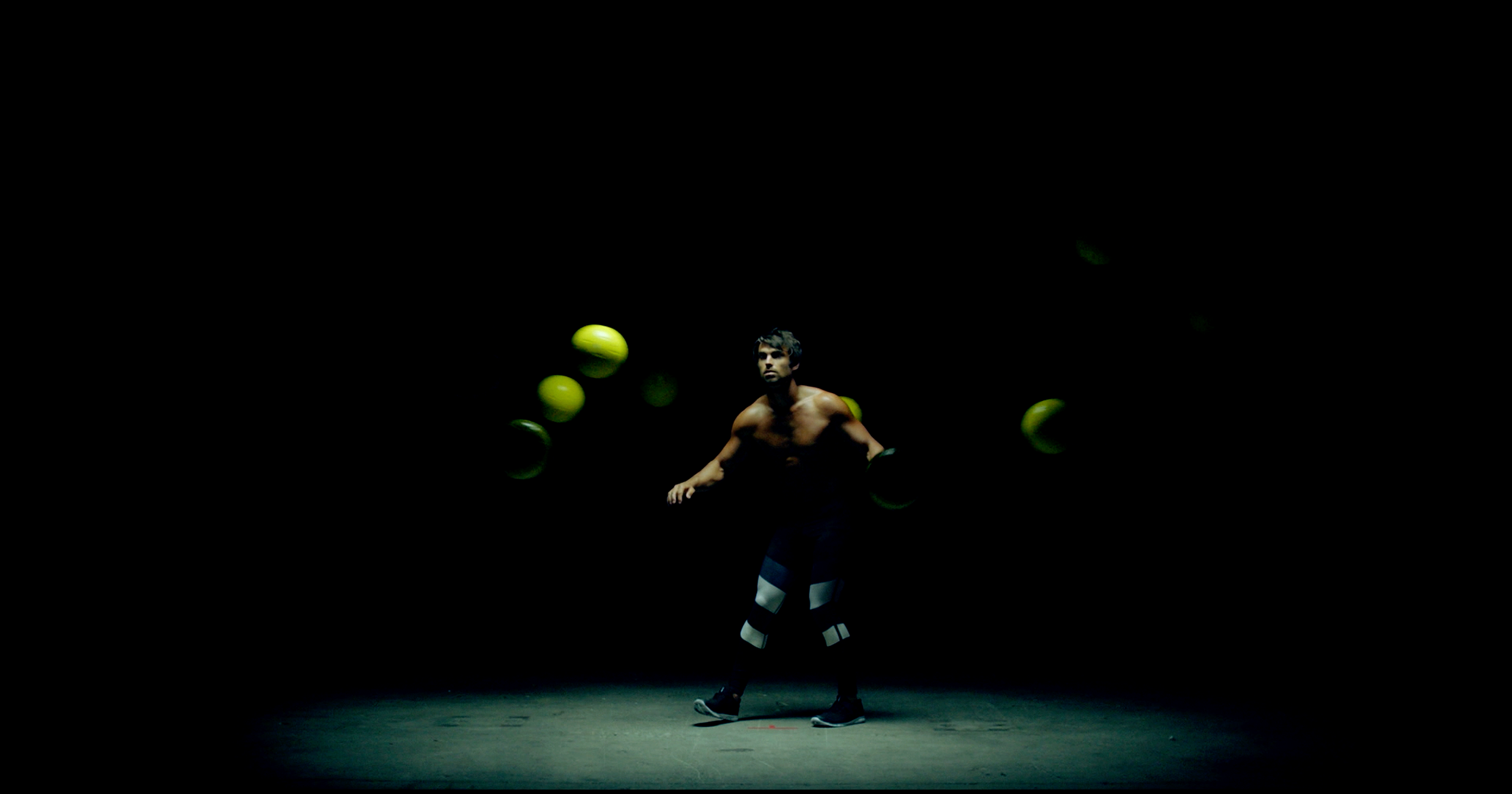
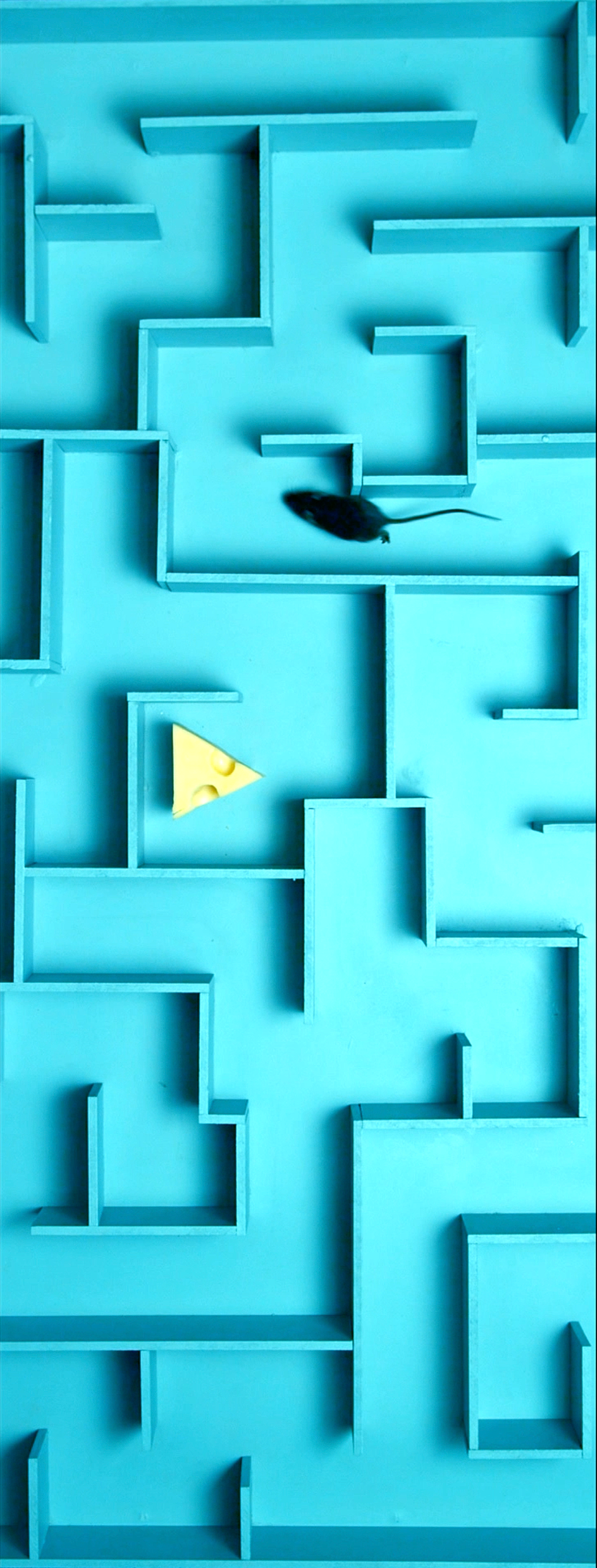
THEY WEREN'T JUST CONTESTANTS. THEY WERE VARIABLES IN THE EXPERIMENT.
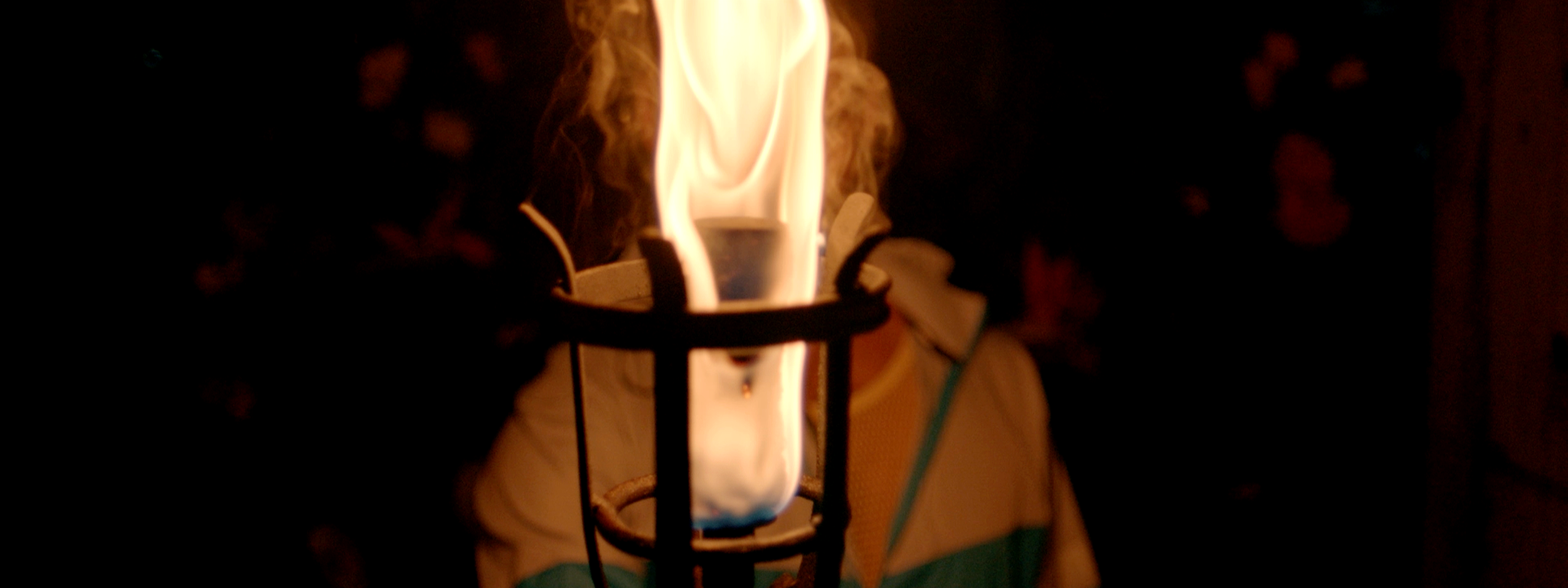
Each contestant became their own character study, built from their actual words about how they intended to play: who they’d manipulate, who they’d align with, and how they planned to dominate the rest of their competition.
A large-scale shoot brought together bespoke sets, wardrobe, props and talent to create a library of assets that could live everywhere.
Hero films, contestant spots, stills, digital, print, OOH and social - I built and directed everything as a complete visual campaign, rather than a collection of promos.
The same visual language travelled across adshells, posters, billboards and digital, making it all feel less like promotion for a new show and more like an experiment that’d escaped into the real world.
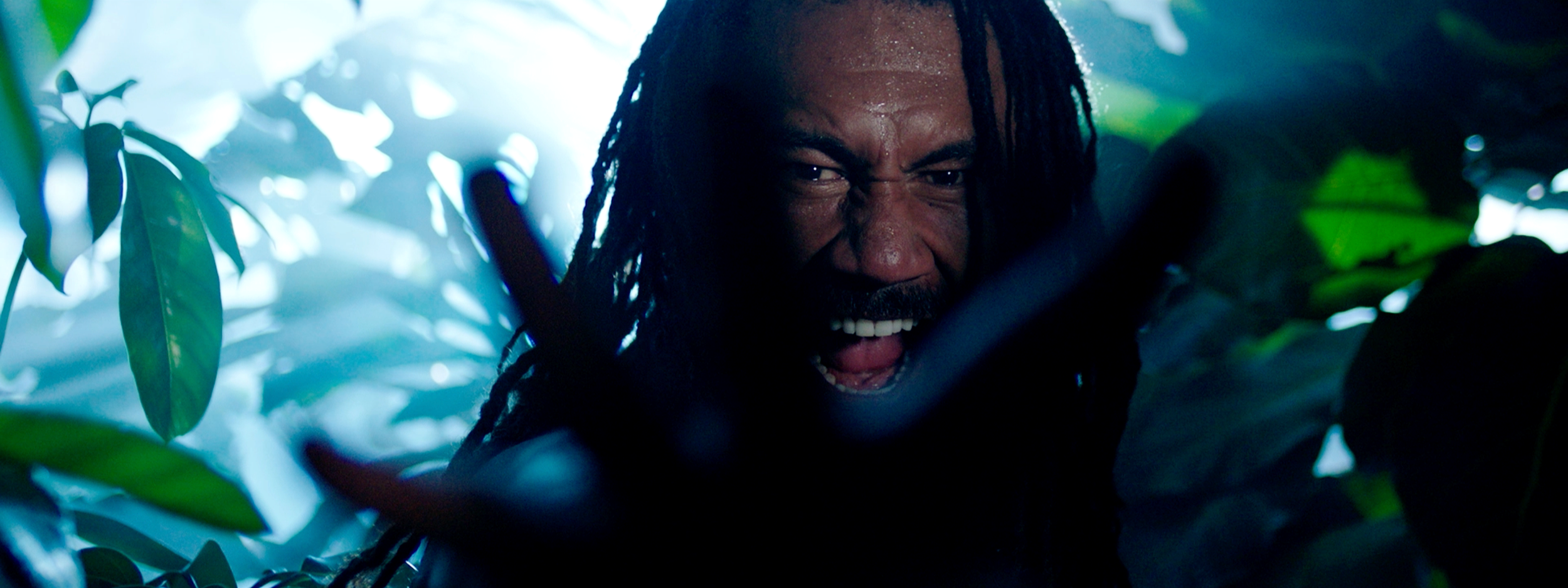

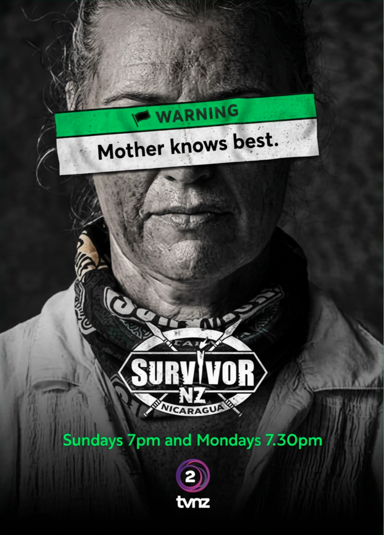
It introduced the contestants as the spectacle.
The physical world followed too: Survivor HQ, a shipping container installed at TVNZ's Auckland site, became a destination for additional content, interviews and audience engagement.
Before anyone knew who would survive, audiences already had reasons to choose sides. The result was a launch that didn't simply introduce a new reality series…
Results:
230,000+
average viewers (5+)
172,000
viewers aged 25–54 at launch
Top 5
frequently among TVNZ OnDemand's most-streamed shows